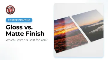
The decision matters more than it looks. Your finish affects how vivid the colors appear, whether the poster is readable under bright lights, how it holds up to handling, and whether it works behind a frame. Choose wrong, and a great design can look washed out, glare-ridden, or flat-out unprofessional in its display environment.
This guide breaks down both finishes clearly — what they do, where they work, and how to pick the right one for your specific project.
Key Takeaways
- Gloss is shiny and reflective — best for bold, color-heavy promotional designs in controlled lighting
- Matte is flat and non-reflective — better for text-heavy content, artistic prints, or framed displays
- Lighting is the biggest decision factor — gloss struggles in bright rooms, matte handles them well
- Behind glass? Matte is the safer choice to avoid double-glare
- No universal winner — the right finish depends on your content, location, and purpose
Gloss vs. Matte Posters: Quick Comparison
Here's the side-by-side breakdown:
| Factor | Gloss | Matte |
|---|---|---|
| Surface look | Shiny, reflective | Flat, non-reflective |
| Color impact | Vivid, high-contrast | Softer, more subdued |
| Glare | High — problematic in bright light | Minimal — handles any lighting |
| Fingerprints | Shows easily | More forgiving |
| Framing under glass | Risky — creates double glare | Recommended |
| Best for | Photos, promotions, events | Art prints, signage, offices |
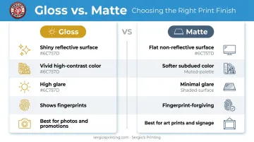
The core trade-off: gloss delivers visual punch. Matte delivers viewing reliability.
What Is a Gloss Finish Poster?
A gloss finish uses a reflective coating applied to the paper surface that creates a shiny appearance. That coating does two things at once — it limits ink absorption so colors sit sharper on the surface, and it amplifies perceived vibrancy. Sappi's Magno Gloss describes this effect directly: the finish is designed for "vibrant colour reproduction" and "finest image detail." For promotional printing, that translates to reds that feel more intense, photos that look more dynamic, and designs that grab attention faster.
The catch is lighting. Gloss is specular — it reflects light directly back at the viewer. PosterPrint's finish selection guide puts it plainly: gloss is inadvisable in a brightly lit office because the shine makes the print difficult to view. The same principle applies to rooms with overhead spotlights or large windows. Gloss performs best in environments with controlled, even artificial lighting.
There's a handling issue too. VistaPrint's print guide notes that glossy prints are more prone to showing fingerprints and scratches than matte alternatives — worth considering for posters that will be handled frequently or displayed without a frame.
When Gloss Works Best
Choose gloss when your poster needs to stop people in their tracks:
- Bold photography or product imagery
- Sports and entertainment posters
- Retail promotions and sale announcements
- Event posters with vivid color schemes
- Restaurant specials or food-focused designs
- Trade show displays or high-traffic wall signage
For South Florida businesses — restaurants, retailers, event organizers — gloss is a natural fit for short-run promotional campaigns. Sergio's Printing offers gloss poster printing across multiple standard sizes. The online design tool includes templates for Food & Beverage, Events & Entertainment, Fashion & Retail, and more, so you can move from concept to order without a separate design brief.
What Is a Matte Finish Poster?
A matte finish uses a low-reflectivity coating that absorbs light rather than bouncing it back. Sappi describes their matte paper as having a "non-reflective surface" — and that single property drives most of matte's practical advantages.
Without glare, viewers can read the poster from different angles and under varied lighting without squinting or repositioning. That makes matte the stronger choice whenever content needs to be studied — detailed artwork, text-heavy layouts, informational displays, or designs with fine tonal variations where a shiny surface would create competing reflections.
Fingerprint resistance is another practical edge. Matte coatings are more forgiving of smudges than glossy surfaces — a real advantage for posters in high-traffic spaces or anywhere the print gets handled frequently.
One limitation: matte delivers softer, more muted color reproduction than gloss. If vibrancy is the primary objective, matte will feel flat by comparison — that's simply what the finish is optimized for.
When Matte Works Best
Matte earns its place in situations where readability and longevity matter more than immediate visual impact:
- Black-and-white photography or fine art prints
- Minimalist or gallery-style designs
- Text-heavy layouts — menus, schedules, educational materials
- Posters containing QR codes (glare can interfere with scanning in uncontrolled lighting)
- Office displays, classroom signage, and professional environments
- Any poster going into a glass-front frame
For businesses printing menus, event schedules, or informational signage, matte prevents glare from making critical text unreadable under fluorescent or overhead lighting — a problem that gloss creates and matte eliminates. Sergio's Printing's matte finish option is available through the same self-service ordering flow as gloss, so switching between the two requires no extra steps.
Which Poster Finish Is Right for You?
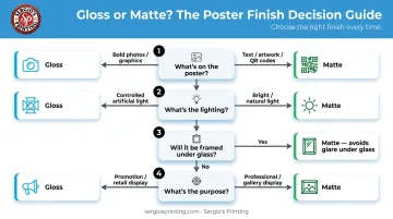
Work through these four questions before you decide:
- What's on the poster? Bold photos and graphics → gloss. Detailed artwork, text, or QR codes → matte.
- What's the lighting like? Even, controlled artificial light → gloss is fine. Bright overhead lights or natural light → matte.
- Will it be framed under glass? If yes, go matte. Glass already adds a reflective layer — combining it with a gloss poster creates double glare that makes the image hard to see.
- What's the purpose? Attention-grabbing promotion → gloss. Professional display, permanent signage, or gallery presentation → matte.
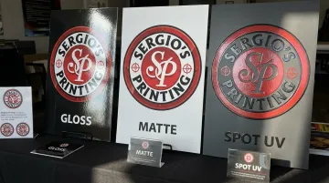
A Note on Spot UV — The Third Option
Sergio's Printing also offers Spot UV (localized UV) as a third finish option — and it's worth considering when neither gloss nor matte fully fits your design. Spot UV applies a raised, high-gloss coating to specific elements (a logo, headline, or key image) while leaving the rest of the surface untouched. That contrast adds dimension that neither full-gloss nor matte can achieve on its own. It works especially well for premium event posters, product launches, or any design with one element that needs to command attention.
Quick Decision Guide
| Your situation | Recommended finish |
|---|---|
| Retail promotion with bold photography | Gloss |
| Event announcement poster | Gloss |
| Restaurant menu or food poster in a bright dining room | Matte |
| Art print going into a frame | Matte |
| Office signage or educational display | Matte |
| High-impact poster with a standout logo element | Spot UV |
| Mixed-use poster (images + significant text) | Matte or Spot UV |
Still not sure? Think about two things: the dominant colors in your design and the room it's going into. Color-heavy, saturated designs tend to work better in gloss; detail-rich layouts in bright or naturally lit spaces tend to work better in matte. Sergio's Printing's team can help you work through the call — reach out at (305) 971-4161 before placing your order.
Conclusion
Gloss and matte aren't competing for the title of "best finish" — they solve different problems. Gloss amplifies color and visual energy for promotional contexts where lighting is controlled. Matte eliminates glare and improves legibility for professional, framed, or detail-focused applications. The right choice comes down to what your poster needs to do and where it will live.
A well-designed poster can still fall flat if the finish works against the environment. Sergio's Printing lets you choose your finish — glossy, matte, or localized UV — alongside your size and design, all in one ordering flow. Whether you're printing a restaurant special, an event announcement, or an office display, the platform includes templates organized by industry to get you from decision to print without the guesswork.
Frequently Asked Questions
Is a matte or glossy poster better?
Neither is universally better. Gloss suits vibrant, color-heavy promotional designs in evenly lit spaces. Matte suits detailed, text-rich, or framed posters in bright or naturally lit environments. The right answer depends on your content and where it will be displayed.
Does gloss or matte cost more to print?
Cost differences are printer-specific. At Sergio's Printing, both finishes are available as standard options in the self-service ordering flow. The bigger price drivers are poster size, paper weight, quantity, and production time — not finish choice.
Which poster finish is better for framing under glass?
Matte is the recommended choice. Glass adds its own reflective layer, and pairing it with a gloss poster creates double glare that makes the image difficult to see clearly. Matte eliminates that problem entirely.
What is Spot UV, and how does it differ from standard gloss?
Spot UV (localized UV) applies a raised, high-gloss coating only to selected areas of the design rather than the entire surface. This creates dimensional contrast between coated and uncoated areas, which full-gloss coating applied uniformly across the surface cannot replicate.
Which poster finish holds up better outdoors?
Gloss finishes offer slightly better resistance to moisture than matte for short-term outdoor exposure. For any long-term outdoor display, the finish choice matters less than the substrate and protective treatment — lamination or an outdoor-rated material is the more important factor.
Can you write on a matte poster?
Yes. Matte surfaces are easier to write on with markers or pens, since the texture lets ink grip and dry without smearing. High-gloss UV-coated surfaces can cause ballpoint ink to smudge or bead, so avoid them if you need to annotate or sign the poster.